

In this guide, we explain the London banana hand-drawn map, with real rents, transport data and borough information to give more context for anyone considering a move to the capital.
The London banana at a glance
- The London banana is a graphic created by Saul Sadka and shared on X in August 2025.
- It’s controversial because residents say it’s based on wealth and one person’s opinion.
- If you’re moving to the UK, other areas in London could offer cheaper rents, more safety and better transport links.

What is the London banana?
The London banana is a U-shaped map created by commentator Saul Sadka and shared on X in August 2025, outlining what he considers London’s most desirable neighbourhoods across west, north, and parts of south London. At Remitly, we’ve watched the idea spread fast, and spark just as much pushback.
The London banana groups nine affluent, well-connected neighbourhoods in west, north, and south London into a rough U-shape. It’s a useful shorthand for areas with strong transport links, not a reliable guide to where you’ll actually be happy — East and South-East London have plenty to offer too.
Sadka’s original post put it bluntly: “As long as you stay within the Banana, you’ll have a great time in London. Almost everything outside the Banana is horrible these days, best avoid.” That line is why the map keeps resurfacing on timelines over a year on, with local reporters still fielding reactions from residents on both sides of the line, and why anyone weighing up a move to London is right to ask how much it’s actually worth trusting.
Which areas does the London banana map cover?
Sadka’s map isn’t built from data, it’s a hand-drawn, subjective sketch of nine neighbourhoods he rates as London’s best, loosely grouped into west, north, and south. Good transport links are the common thread running through all nine, as our guide to train stations in London shows, though rents vary sharply between them. Where we quote rent figures below, they come from the Office for National Statistics’ Price Index of Private Rents for July 2026, the most consistent borough-level source available, since asking prices for individual streets move too often to quote reliably.
West London: Kensington, Chelsea, and Notting Hill
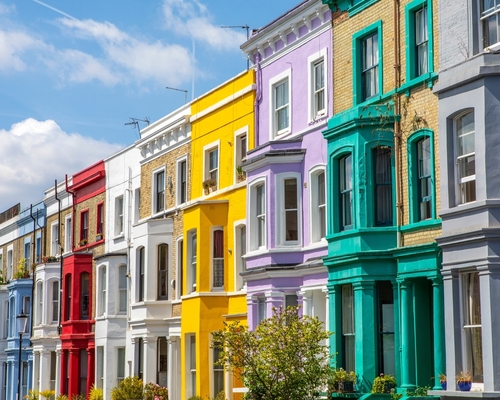
Notting Hill, Kensington, and Chelsea anchor the western tip of the banana. All three sit in or near Zone 1, and the borough of Kensington and Chelsea had an average monthly rent of £3,629 (GBP) in July 2026, the highest of any area on the map. The area connects to Heathrow and the rest of west London, though that convenience comes at a famously steep price. Residents, rather than day-trippers, are the ones who get the real benefit of Notting Hill’s Portobello Road market and the museum quarter around South Kensington: everyday amenities on the doorstep, not just weekend attractions.
North London: Hampstead, Islington, and Primrose Hill
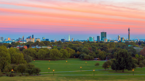
Hampstead and Primrose Hill sit within Camden, where average rent reached £2,800 in July 2026; Islington next door averaged £2,854, up 5.9 per cent on the year. Primrose Hill, smaller and largely residential, has average rent rates of £4,100 per month, according to estate agent Foxtons. It commands a premium for its park views despite limited high-street shopping. Hampstead Heath and Regent’s Canal offer a natural escape from the bustle of London life. However, Hampstead’s Northern line and Overground stops sit in Zones 2 and 3, and journeys into the City can involve a change, while Islington‘s Angel and Highbury & Islington stations offer faster, more direct commutes.
South London: Richmond, Clapham, and Brixton
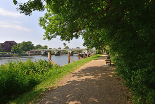
Richmond sits furthest out, on the Zone 3/4 boundary, with average rent of £2,318, a longer commute for a leafier, riverside setting. Clapham and Brixton, both in Lambeth (average £2,519), are firmly Zone 2 and popular with young professionals. Brixton’s inclusion is the map’s most contested call: it’s a culturally significant neighbourhood, shaped by Black British and Caribbean communities, now facing rapid gentrification. Treating it as simply “desirable” glosses over that tension without acknowledging what’s being priced out.
Why is the London banana so controversial?

The backlash was immediate. Sadka’s post was picked up widely, and critics zeroed in on two things: what the banana leaves out, and what “desirable” seems to mean.
The most obvious gap is geography. East and South-East London, home to millions of people, don’t appear at all. This is despite decades of investment and some of the city’s most distinctive neighbourhoods – such as Shoreditch and Peckham.
The second criticism goes deeper. “The banana is misleading as it suggests that only places that are expensive are ‘nice,’ which I personally disagree with,” said Zanya Fechner, a 24-year-old Londoner interviewed by The Standard after the map went viral. Others were blunter, dismissing the whole idea as “a load of rubbish.” The shared thread in the criticism is that the banana measures affluence, not liveability, and treats the two as the same thing. One long-term Hampstead resident put it more gently, noting that London “defies easy classification” and that most neighbourhoods are far more mixed, socially and economically, than a single line on a map can show.
London areas outside the banana: neighbourhoods the map leaves out
None of this means the areas outside the banana are worse, just less affluent, or less familiar to whoever drew the line. Six are worth a closer look if you’re weighing up where to live, each with its own transport links, price point, and community feel.
Hackney and Shoreditch
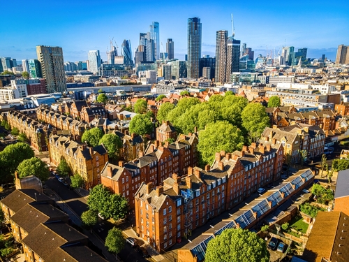
Hackney and Shoreditch, both Zone 2 (Shoreditch nudges into Zone 1), sit at the heart of east London’s creative and nightlife scene, with average rent in Hackney of £2,644 in July 2026. It’s easy to get to the City, part of why it’s drawn so many new residents in recent years.
Peckham and Camerbwell

Peckham, in Southwark (average £2,431), has one of London’s most talked-about food and arts scenes, built by a genuinely mixed community rather than a single demographic. Last year, Camberwell made TimeOut’s list of the coolest neighbourhoods in the world, and it’s still one of the most desirable areas in London in 2026. It features a similar mix of mix of multiculturalism, great food, and galleries.
Greenwich
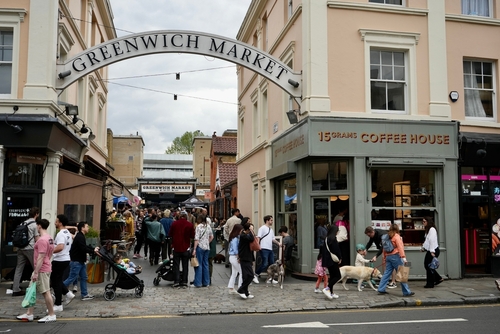
Greenwich pairs royal parkland and river views with some of the more affordable rents on this list, at £1,980 a month, plus Zone 2 and 3 rail and DLR links into central London.
Walthamstow
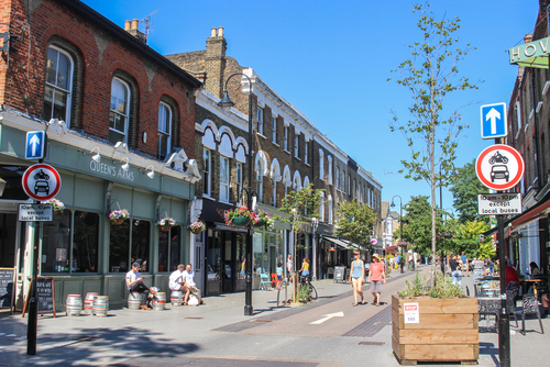
Walthamstow, out in Zone 3, keeps a strong sense of community around its market and waterways, with average rent of £1,765 across the Borough of Waltham Forest, noticeably lower than anywhere inside the banana.
How to choose where to live in London: what the banana gets right (and wrong)
The banana isn’t wrong that transport links and affluence tend to travel together, it’s just an incomplete way to choose a home. For international movers in particular, the trade-offs a viral map skips over often matter more than postcode prestige: how close you’ll be to people from your own community, whether a shorter commute matters more than square footage, and how far a budget stretches once private rent, council tax, utilities, and everyday costs are all converted into GBP. Staying near familiar faces and food, as our guide to dealing with homesickness covers, can matter as much as landing inside anyone’s idea of the best areas to live in London.
A more useful approach is to treat the banana as one data point, not a verdict: check current rents on Rightmove or Zoopla, look up a postcode’s TfL zone before committing to a commute, and weigh schools, community, and lifestyle fit alongside price rather than a neighbourhood’s reputation.
FAQs
What is the London banana?
It’s a U-shaped map created by commentator Saul Sadka and shared on X in August 2025, marking out nine neighbourhoods in west, north, and south London he considers the city’s most desirable. It isn’t based on official data, it reflects one person’s view of London.
Which neighbourhoods are inside the London banana?
The map covers Notting Hill, Kensington, and Chelsea in the west; Hampstead, Islington, and Primrose Hill in the north; and Richmond, Clapham, and Brixton in the south. Together they form the rough U-shape that gives the map its name.
Why is the London banana controversial?
Critics point out that it excludes East and South-East London entirely, and that it equates high rents with quality of life. Many Londoners in and around the excluded areas have called the framing elitist and out of step with how the city has changed.
Are the areas inside the London banana the safest in the city?
No, while the London banana map includes some affluent and lower-crime boroughs, these areas are not necessarily all the safest in London. Westminster and Camden, for instance, have high visitor levels and some of the highest crime rates in the London, according to Police.uk.
What are good areas to live outside the banana?
Hackney and Shoreditch in the east, Peckham and Greenwich in the south-east, and Walthamstow in the north-east all offer strong transport links, active community life, and, in most cases, lower rents than areas inside the banana.
Is the London banana a reliable guide for choosing where to live?
It’s a reasonable starting point for spotting well-connected, established neighbourhoods, but not a complete one. It says nothing about community fit, schools, or personal budget, and it leaves out large parts of London that suit many people well, particularly if you’re new to the city and don’t yet have a strong sense of which trade-offs matter most to you.
How much does it cost to rent in London banana neighbourhoods?
Average monthly rents in July 2026 ranged from around £2,318 in Richmond to £3,629 in Kensington and Chelsea, according to the Office for National Statistics’ Price Index of Private Rents, among the highest averages of any London boroughs, and a reminder that “desirable” and “affordable” don’t always overlap in these particular postcodes.
Key takeaways
- The London banana is a hand-drawn map by commentator Saul Sadka, shared on X in August 2025, marking nine neighbourhoods he considers London’s best.
- It covers Notting Hill, Kensington, and Chelsea in the west; Hampstead, Islington, and Primrose Hill in the north; and Richmond, Clapham, and Brixton in the south, with rents from around £2,318 to £3,629 a month.
- Critics call it elitist for excluding East and South-East London and for treating affluence as a proxy for liveability.
- Hackney, Shoreditch, Peckham, Greenwich, and Walthamstow all offer strong transport links and community life at lower average rents.
- For anyone actually moving to London, budget, commute, and finding a local community matter more than whether a neighbourhood made it into someone’s viral map.
Making your own call on London’s best areas
No single map, viral or otherwise, can tell you where you’ll feel at home in a city as varied as London. The banana is a decent icebreaker for understanding one version of “desirable,” but it’s worth checking current listings on Rightmove or Zoopla, mapping your likely commute on the TfL journey planner, and exploring libraries and other community resources in a few areas before you decide. However you narrow it down, we hope these notes help you feel a little more confident about wherever you land in London, banana or no banana.
Last reviewed: September 2026