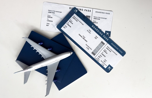
Let’s be honest: most of us don’t pay much attention to our airline boarding passes. Once we’ve boarded the plane, we tend to just throw them away. That’s if we even get a paper pass anymore instead of a digital one on our phones.
But some boarding passes are works of art. To celebrate their brand identity and cultural heritage, airlines often create airline boarding passes with the coolest designs to enhance your travel experience. And at Remitly, we love to celebrate when anyone tries to bring a little more beauty into travel.
In this article, we’re going to take a look at the most visually striking boarding pass designs from airlines around the world. We’ll dive into the creative thinking behind them and explore what they say about the brand and the art of travel in general.
Why boarding pass design matters
Before passengers even step onto a plane, a boarding pass serves as a connection between them and the airline. These documents tell you important information such as your seat number, departure time, and sometimes your gate, but they can do much more than that.
The layout, design, and materials used all reflect the brand’s attention to detail and the values they want to express. That’s why creative airline boarding passes have become an essential part of modern airline design.
For example, a minimalist, well-structured boarding pass can give a sense of efficiency and reliability. One with vibrant colors or tactile finishes, on the other hand, conveys excitement and exclusivity. The coolest boarding pass designs are the ones that understand that visual identity can influence emotion.
The best-designed boarding passes can become souvenirs of an unforgettable trip. I still have boarding passes from some of the most significant flights of my life, the ones where I moved to another country to start a new life. Other people have a boarding pass collection built around aviation graphics, favorite trips, or the boarding passes with the best design.
Ultimately, these simple pieces of paper can serve as mementos of some of life’s biggest moments.
Airlines leading the design revolution
Virgin Atlantic: bold and vibrant
Virgin Atlantic has always been an airline that tries to bring some fun and excitement to air travel. And they’re known for their bold and vibrant boarding pass design.
The airline uses its famous red color across multiple elements of the pass, from the logo to the accent lines, creating an instant connection to its brand. The pass also uses a clean layout and modern type to make it easy to read as well as cool to look at.
Sometimes, Virgin even releases special edition boarding passes for holidays and major events. These passes are practically made to be collected, showing how an airline’s choice of boarding pass design can contribute to its brand image.
Singapore Airlines: elegant minimalism
Singapore Airlines goes for the minimalist, elegant approach for its boarding pass design. They use a clean and simple layout with soft gold accents that emphasize their luxury image. They also print their boarding passes on high-quality cardstock, giving them a smooth, premium feel and making them more durable.
Singapore Airlines also brings in some color by color-coding the different classes of tickets. An economy ticket has a simple white or green header, while business class is dark blue, first class is red, and the exclusive suites have a stylish gold header.
Air New Zealand: cultural heritage
Air New Zealand’s boarding pass design is a great example of how design can celebrate cultural heritage. The airline often features Māori patterns along with imagery inspired by New Zealand‘s natural landscapes. These artistic details connect travelers to the spirit of Aotearoa from the moment they check in.
These designs blend cultural authenticity with modern style, using clean layouts and contemporary fonts to keep things fresh. Air New Zealand often releases seasonal and commemorative boarding passes for special routes, making each one into a collectible piece of aviation art.
Emirates: luxury and sophistication
Luxury and elegance are a big part of the Emirates brand, and that’s reflected in their boarding pass. Their signature burgundy color scheme adds a splash of color and warmth to the document, and subtle Arabic calligraphy brings tradition and heritage to this modern aviation design. The first class boarding passes feature enhanced materials with embossed details to add to the exclusive feel of the luxurious cabins.
JetBlue: playful and modern
JetBlue uses its boarding pass design to reflect its fun, friendly personality. Contemporary graphics with bright colors and bold fonts make the passes stand out. They often release special destination-themed passes with creative visuals celebrating cities like New York, Boston, and Los Angeles. This helps them appeal to younger travelers and families, a key market for this affordable airline.
Regional standouts
European innovations
Europe is a place where tradition meets innovation, and it’s home to some of the most famously stylish countries in the world. So maybe it’s not a surprise they have some of the coolest airline boarding pass designs, too.
KLM Royal Dutch Airlines celebrates its Dutch heritage. They use calming blue tones straight from the national flag, combined with elegant fonts and minimalist layouts.
Lufthansa, the German national carrier, uses clean, efficient, perfectly aligned passes that are all about order and clarity. The balanced white space and gold heading echo the brand’s focus on quality.
Air France celebrates the country it represents with red, white, and blue boarding passes. The clean lines and subtle use of the Air France wing logo give the pass a sense of timeless sophistication.
Asian excellence
Asian airlines combine cultural symbolism and refined travel design to create some of the best-designed boarding passes around.
Japan Airlines embraces a minimalist approach that reflects Japan’s design philosophy of simplicity and balance. They use clean white backgrounds and clear type with subtle red accents taken straight from the Japanese flag, giving the boarding pass a calm, elegant feel.
Korean Air uses soft blues and silvers with modern icons that reflect South Korea’s technological achievements. They also include traditional Korean characters to blend the past with the future.
Hong Kong’s Cathay Pacific uses rich green tones from its signature color scheme and graceful typography that make the passes both easy to read and pleasing to look at. Sometimes, they release limited editions that celebrate Hong Kong festivals and major milestones.
Creative surprises from smaller airlines
It’s not always the giant airlines that have the coolest airline boarding pass designs. Great aviation design is a way for a smaller boutique airline to set itself apart and create a strong brand identity.
Eva Air, based in Taiwan, released an exclusive Sanrio digital boarding pass on its app for certain routes, complete with Hello Kitty cartoon characters.
Meanwhile, Southwest Airlines was once famous for its plastic boarding passes. This airline does not assign seats (although that’s changing in 2026), so passengers used to pick up numbered and color-coded plastic passes, which divided them into boarding groups for more efficient boarding. The cards were then collected as the passengers got on the plane and later reused.
However, these passes were discontinued after additional security measures were introduced following September 11, 2001.
The design elements that make boarding passes memorable
Designing boarding passes is serious business. Every boarding pass needs to convey essential information and be readable by machines, but it’s also a chance for an airline to inject some personality into this important document.
Fonts
Fonts are part of the statement. Bold, modern typefaces reflect innovation and energy, while elegant serif fonts convey heritage and luxury. It’s a delicate balance to make sure that the text is easily readable at a glance but also aesthetically pleasing.
Colors
Color psychology also plays a big role. Most airlines use their brand colors on their boarding passes, and those colors are chosen for a reason. Warm colors like red and gold evoke excitement, while blues and silvers communicate a sense of calm, trust, and professionalism.
Imagery and special touches
Imagery, patterns, and symbols are sometimes used too. Air New Zealand’s Māori-inspired patterns are great examples of this. Then there are the smaller finishing touches. Embossed logos, metallic foils, and thick cardstock enhance the way a boarding pass feels in your hand.
All these elements together transform a simple ticket into a lasting keepsake. The coolest airline boarding pass designs blend beauty, emotion, and functionality in perfect harmony.
Special edition and commemorative designs
Usually, boarding passes are designed to be functional, but many airlines have released limited edition designs to celebrate holidays, anniversaries, and special events.
For example, back in 2019, American Airlines retired its MD-80 fleet of planes. To celebrate the event, they released a special retro boarding pass that could be personalized as a memento.
China Airlines once created a one-day trip designed for Pokémon fans, with the plane itself specially decorated for the occasion. Passengers also got a luxury gift bundle that included a personalized commemorative boarding pass.
Special boarding passes like this often become collector’s items, helping to create a strong brand identity for the airlines that issue them.
Enjoy the world’s best-designed boarding passes
When you’re rushing for a flight, you might not notice that you’re holding a piece of art. Yet many airlines release beautiful boarding passes designed to be a great keepsake of your trip. They come at no extra cost, and they can bring back great travel memories.
Next time you fly, take a minute to appreciate the creative airline boarding pass in your hand. Every detail represents a choice someone made to bring some beauty into everyday travel.
FAQs
Are paper boarding passes becoming obsolete?
Digital boarding passes are becoming the norm thanks to online and mobile check-in, which makes travel faster and more convenient. However, paper versions are still issued when you check in at the airport counter.
Why do airlines invest in boarding pass design?
Beyond functionality, design helps airlines build emotional connections with travelers. A well-designed pass reinforces brand identity and creates a more memorable experience, even before passengers step onto the plane.
What’s the best way to preserve or display boarding passes?
You can store your boarding passes flat in a travel journal or an acid-free photo album to stop them from fading, or scan or photograph each pass before it wears out. Some collectors display boarding pass collections in shadow boxes, framed world maps, or digital scrapbooks. Others use them for travel-themed decor, combining boarding passes with postcards and luggage tags for a nostalgic touch.